So you want to create a stack graph in gnuplot but there’s no “stack” function. This isn’t the first blog to be written about it but will document my approach to solving this problem.
Essentially you want to create several graphs drawn on top of each other. In this case if we have, say, 5 lines we want to stack on top of each other then we start with the first column and sum it with all the columns to the right of it and plot it with fillcurves (gnuplot will automatically choose a colour for us). Then we take the second column, sum it with all the columns to the right of it, and plot it with fillcurves which will be drawn over the top of the most recent plot. And so forth up to the last column of data which doesn’t need to be summed with anything else but plotted over the top of the others with fillcurves.
Here is an example of the essential plot commands (for an X/Y plot by date):
plot \
  "feeds.data" using 1:($2+$3+$4+$5+$6) title 'Bloomberg' with filledcurves x1, \
  "feeds.data" using 1:($3+$4+$5+$6) title 'Yahoo' with filledcurves x1, \
  "feeds.data" using 1:($4+$5+$6) title 'MSN' with filledcurves x1, \
  "feeds.data" using 1:($5+$6) title 'Google' with filledcurves x1, \
  "feeds.data" using 1:($6) title 'DowJones' with filledcurves x1
If you’re wondering what x1 is doing after filledcurves it specifies from which axis to fill the curve up to (x1 being the bottom horizontal axis).
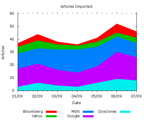
If we were to populate feeds.data with:
2013-09-01,3,5,12,14,3
2013-09-02,5,6,12,15,6
2013-09-03,2,4,16,12,4
2013-09-04,1,3,18,11,3
2013-09-05,3,4,15,13,6
2013-09-06,7,3,12,21,9
2013-09-07,5,4,11,18,8
and fed it into the following plot:
set title "Articles Imported"
set xdata time
set timefmt "%Y-%m-%d"
set datafile separator ","
set terminal png size 480,400 enhanced truecolor font 'Verdana,9'
set output "articles_imported.png"
set ylabel "Articles"
set xlabel "Date"
set xrange ["2013-09-01":"2013-09-07"]
set yrange [0:10<*]
set pointsize 0.8
set format x "%d/%m"
set border 11
set xtics out
set tics front
set key below
plot \
  "feeds.data" using 1:($2+$3+$4+$5+$6) title 'Bloomberg' with filledcurves x1, \
  "feeds.data" using 1:($3+$4+$5+$6) title 'Yahoo' with filledcurves x1, \
  "feeds.data" using 1:($4+$5+$6) title 'MSN' with filledcurves x1, \
  "feeds.data" using 1:($5+$6) title 'Google' with filledcurves x1, \
  "feeds.data" using 1:($6) title 'DowJones' with filledcurves x1
The result is the following graph:
GNUPlot Graph Simulating a Stack Plot
Using the Sum Function
I was recently made aware of this forum post which referenced this blog article – and shows a modernised and improved way of drawing a stack graph.
As of Gnuplot v4.4 the iterative plot for command can be used to generate the multiple graphs.
As of Gnuplot v4.6 the sum command can be used.
Putting this altogether let’s re-use our data file – but this time put the titles of the columns in the first row of the data:
,Bloomberg,Yahoo,MSN,Google,DowJones
2013-09-01,3,5,12,14,3
2013-09-02,5,6,12,15,6
2013-09-03,2,4,16,12,4
2013-09-04,1,3,18,11,3
2013-09-05,3,4,15,13,6
2013-09-06,7,3,12,21,9
2013-09-07,5,4,11,18,8
Now we replace the previous plot command with:
set title "Articles Imported"
set xdata time
set timefmt "%Y-%m-%d"
set datafile separator ","
set terminal png size 480,400 enhanced truecolor font 'Verdana,9'
set output "articles_imported.png"
set ylabel "Articles"
set xlabel "Date"
set xrange ["2013-09-01":"2013-09-07"]
set yrange [0:10<*]
set pointsize 0.8
set format x "%d/%m"
set border 11
set xtics out
set tics front
set key below
plot \
  for [i=2:6:1] \
    "feeds.data" using 1:(sum [col=i:6] column(col)) \
      title columnheader(i) \
      with filledcurves x1
The for [i=2:6:1] sets up a counter that increments variable i by 1 starting at 2 until it gets to 6 (note that the first data column is 2 because the date is in column 1).
The sum [col=i:6] column(col) command sums up the columns from column i to column 6.
The title columnheader(i) takes the title of the particular row from the header.
In pseudo-code (Perl) this looks like:
for ( $i = 2; $i <= 6; $i += 1 ) {
  my @to_sum;
  for ( $col = $i; $col <= 6; $col += 1 ) {
    push( @to_sum, value_in_column( $col ) );
  }

  plot( $i, sum( @to_sum ) ); # plot line $i
}
The resulting image is identical to the one above using the old-style plot command.
If our stack is not too complicated we can add black lines between each colour by adding to the plot command:
plot \
  for [i=2:6:1] \
    "feeds.data" using 1:(sum [col=i:6] column(col)) \
      title columnheader(i) \
      with filledcurves x1, \
  for [i=2:6:1] \
    "feeds.data" using 1:(sum [col=i:6] column(col)) \
      notitle \
      with lines lc rgb "#000000" lt -1 lw 1
This results in the following graph:

Gnuplot stacked graph with outlines between layers
Note that you can change the lines’ attributes such as colour with the lc rgb colour command; the type with the lt type command (where -1 is a solid line); the width with lw width command.
You can determine the default line types for a particular terminal type by replacing the plot command with the test command. The Gnuplot manual states:
The default linetypes for a particular terminal can be previewed by issuing the test command after setting the terminal type. The pre-defined colors and dot/dash patterns are not guaranteed to be consistent for all terminal types, but all terminals use the special linetype -1 to mean a solid line in the primary foreground color (normally black).
Doing so with the png terminal gives the following:

Gnuplot build-in test graphic
The right-hand side of this test image gives the default line types.


Recent Comments